Why OCR Accuracy Varies
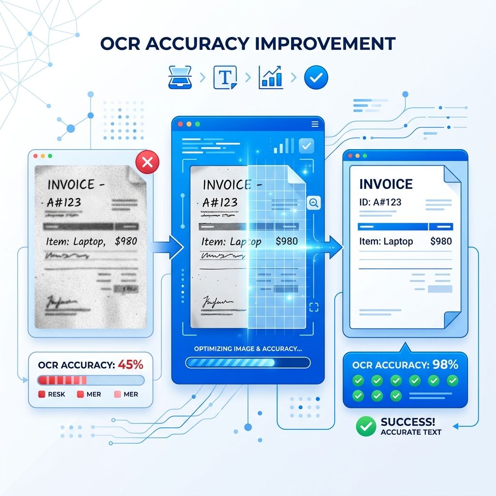
You've uploaded an image to an OCR tool and the output looks like gibberish. Sound familiar? OCR accuracy depends heavily on the quality of your input image. The good news: a few simple adjustments can take your results from unusable to near-perfect.
Here are 10 proven tips, ranked from most impactful to easiest quick wins.
1. Use High-Resolution Images
This is the single biggest factor in OCR accuracy. Low-resolution images don't give the OCR engine enough pixel data to distinguish between similar characters.
Rule of thumb:
- 300 DPI or higher for scanned documents
- 1080p or higher for phone photos
- Avoid zooming and cropping small text from large images — get closer instead
2. Ensure Good, Even Lighting
Shadows, uneven lighting, and glare are OCR killers. They create dark patches that hide characters and bright spots that wash them out.
How to fix it:
- Use natural, diffused light (near a window, not in direct sunlight)
- Turn off your camera flash — it creates glare, especially on glossy paper
- If photographing a screen, reduce screen brightness to minimize glare
3. Maximize Contrast
OCR works best with dark text on a light background. Low contrast (gray text on slightly lighter gray) significantly reduces accuracy.
Tips:
- For physical documents, use a white or light-colored surface underneath
- For screenshots, use the app's light mode if available
- Avoid colored or patterned backgrounds behind text
4. Keep the Image Straight
Skewed or tilted text forces the OCR engine to work harder to identify character boundaries. Even a slight angle can reduce accuracy.
How to fix it:
- Hold your phone directly above the document, looking straight down
- Use your phone's grid overlay (camera settings) to align edges
- If scanning a book, press the page flat against a surface
5. Choose PNG Over JPG When Possible
JPG compression creates artifacts around text edges that confuse OCR engines. PNG preserves every pixel exactly as-is.
- Screenshots → Save as PNG (most systems do this by default)
- Scanned documents → Save as PNG or TIFF, not JPG
- Camera photos → JPG is fine for large, clear text; PNG is better for small text
For a deeper dive, read our JPG vs PNG for OCR comparison.
6. Select the Correct Language
OCR engines use language-specific dictionaries and character sets to improve recognition. If you're extracting Arabic text but the language is set to English, accuracy will be terrible.
Always check:
- Set the language before processing
- For mixed-language documents, choose the primary language
- Our tool supports 28+ languages — select the right one from the dropdown
7. Crop Unnecessary Areas
The less non-text content in your image, the better. Backgrounds, logos, decorative elements, and borders can confuse the OCR engine.
Before uploading:
- Crop to include only the text area
- Remove headers/footers if you only need the body text
- Exclude images and graphics that aren't text
8. Clean Up the Image
If your source image is noisy (speckled, stained, or faded), consider cleaning it up before OCR:
- For phone photos: Most gallery apps have auto-enhance features
- For scanned documents: Increase contrast and brightness slightly
- For old/faded documents: Use a "black and white" or "document" camera mode
9. Use Appropriate Font Sizes
OCR struggles with text that's too small or too large:
- Too small (below 8pt) — not enough pixels per character
- Too large (decorative headers) — often uses stylized fonts that confuse recognition
- Sweet spot — 10pt to 14pt standard fonts give the best results
10. Process One Page at a Time
Don't try to photograph a two-page spread or multiple documents in one image. Each page should be captured individually for best results.
Why:
- More pixels per character = better accuracy
- No gutter shadow from book bindings
- Cleaner character boundaries
Quick Reference Checklist
| Factor | Best Practice |
|---|---|
| Resolution | 300+ DPI or 1080p+ photo |
| Lighting | Even, natural, no shadows |
| Contrast | Dark text, light background |
| Alignment | Straight, not tilted |
| Format | PNG over JPG when possible |
| Language | Set correctly before processing |
| Cropping | Text area only, no clutter |
| Cleanup | Remove noise, increase contrast |
| Font size | 10-14pt sweet spot |
| Pages | One page per image |
Test Your Improvements
Apply these tips to your next image and try our Extract Text from Image tool. You'll notice an immediate difference in accuracy.